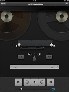
So Apple just released a special app for podcasts for the iPad. I think yipee, because before this you had to depend on a computer to subscribe (or independent apps which didn't connect to iTunes). Also the interface of the iPad's music player is... sigh, I'm sorry, it's just awful, I haven't yet figured it out after two years! Well, I can use it, but it's ugly, non-intuitive, and very poor for podcasts/audiobooks.
 To my joy, at first glance, the Podcast app's interface is clear as a bell. Big, clear buttons. And there's a 10-second backwards button and a 30-seconds forwards button. Kewl.
And then I saw it: get this... the app has no timeline.
I'm just stunned. Say you want to go back 25 minutes to re-listen to a special segment, like an interview, you're basically boffed. Trying to do that with the little jump buttons, while not knowing where you are in the file (it does not even show how long it is!), is just ridic. I'm sorry, Fail to Apple for this.
The dedicated iPods with physical scroll wheels are OK for podcasts and audiobooks. Not great, but OK (For example, if you hold down the left button, it'll scroll back. Not with great precision, but it sort of works). But the iOS apps for them on iPod Touch, iPhone, and iPad need important changes to become really usable.
... No timeline... it's like building a car with no way to see the road.
Update:
It was too stupid to be true. But the truth is also almost too stupid to be true: you have to tap on the picture to reveal most of the control interface! No indications whatsoever that you have to do that. Hidden navigation, gotta love that.
Len wrote to me:
 I think if you tap on my photo when the podcast is running the photo will roll up like a windowshade and reveal the timeline, along with a sort of superfluous image of an old-fashioned tape recorder.
 Yeah... It's sort of pretty (though very dark), but how many of Apple's customers have even seen one of these? I guess the people who hate the superfluous leather and stitching in Apple's Notes and Calendar apps really hate this part.
It reminds me of another pet peeve: the menus on the iPad very often do not show in any way that there is more menu hidden below the bottom item. No scroll bar, no arrows, nothing. And it's especially non-intuitive since the menus usually do not take up the whole screen. A good designer would fit as much as the menu into the space as he can, not hide half the menu, and especially not hide it in a way so it's not visible that there is more to find.
Example:
Perfect, complete menu, yes? (And notice the space under it, wasted.) Clearly these are all your choices.
Nope, if you happen to touch it in the right way, more is revealed:
I'm sorry to sound so bitter. Maybe it's because Apple normally does things so much better than everybody else, that it's a particularly harsh pill to swallow when they mess up, especially when a glaring error stand untouched for years.


No comments:
Post a Comment