I think none of the essential interface designers at Microsoft have studied their Jakob Nielsen. From my own studies of his work, I'll summarize one of the most important rules of user-interface:
-- The buttons/links to important features have to be easy to find. The more important the feature, the more obvious the link/button should be. --
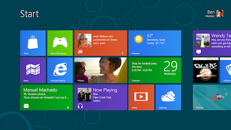
It's just shocking that about all the testers (of various ages and backgrounds) had big problems finding their way back to the single most important screen in the interface: the tiles interface (once called Metro, now confusingly called "Windows 8"...), which is the main navigation center (like the home screen on an iPad). That's like building a car which has the steering wheel hidden under the passenger's seat.
I started reading about these problems over half a year ago: "where is the start button, why did they remove the start button?", everybody said. In all that time, why haven't they done anything about it?
Most of the testers also had problems finding items (as important ones as the Office apps) which were off-screen, because the scroll bar is very hard to see. Unfortunately this is something the iPad also suffers from. The scroll bar in menus is very subtle indeed, and worse, if you ain't touching the menu, it doesn't even show! Sometimes this makes it impossible to notice that there is more items outside the menu.
It reminds me of DVD/blu-ray disk interfaces: very often, it's nearly impossible to tell which of the many elements on the screen is currently highlit. Talk about basic.
I think that many modern designers have forgotten that design serves purpose.
No comments:
Post a Comment